


Colour Trends in 2025 | What Works Best on Hoarding Boards?
Explore the best 2025 colour trends for hoardings with tips on design, industry palettes, and how dibond printing brings visuals to life.

Hoardings remain a powerful tool for outdoor advertising, but in 2025, its all about using colour creatively to stand out. Todays trends favour bold, futuristic hues that spark emotion and boost engagement. A carefully chosen colour palette can increase brand recall and make hoarding boards truly unmissable. With advanced dibond printing, these vibrant colours are not only more eye-catching but also more durable, perfect for high-impact, long-term displays. Whether you're promoting a product launch or branding a busy construction site, understanding colour psychology and using the right materials can transform your hoarding into a striking, memorable piece of outdoor communication.
The Psychology of Colour in Advertising
Colour plays a massive role in how we feel and react to visual messages. Advertisers have long understood the power of colour psychology. Certain hues can inspire trust, encourage spending, or even promote a sense of wellbeing.
On large-scalehoardings, this effect is magnified. A well-chosen colour doesnt just attractit communicates. For example, warm tones like red or orange can suggest urgency or friendliness, while cooler tones like blue and green convey calm, security, and reliability.
The key is to align your message and branding with colours that naturally support those associations. Choosing the right colours can mean the difference between being noticed and being ignored.

Top Colour Trends in 2025
So, whats trending this year in terms of colour? The visual world in 2025 is leaning towards futuristic, calming, and emotionally engaging shades. These colours work beautifully across digital and physical platformsespecially when applied through modern dibond printing techniques on hoarding boards.
Heres a quick overview of the standout colours for 2025:
|
Colour |
Description |
Emotional Impact |
Ideal Industry Use |
|
Digital Lavender |
A calming, modern purple with soft undertones |
Trust, calmness, serenity |
Tech, wellness, lifestyle |
|
Electric Aqua |
A vibrant teal-blue |
Innovation, clarity, energy |
Start-ups, electronics |
|
Apricot Crush |
A warm peach-orange mix |
Positivity, friendliness |
Food, fashion, retail |
|
Galactic Cobalt |
A deep, bold futuristic blue |
Power, trust, stability |
Finance, real estate |
|
Neo-Mint |
A clean green with a digital edge |
Freshness, balance, nature |
Sustainability, beauty |
These colours aren't just trendytheyre strategic. On hoardings, they deliver clear messages and ensure the design looks cutting-edge and purposeful.
How Dibond Printing Brings Colours to Life
To make the most of these stunning colours, the material you print on matters. Thats where dibond printing comes in. Dibond is a type of aluminium composite panel, consisting of two thin sheets of aluminium enclosing a solid polyethylene core. Its strong, lightweight, and perfect for outdoor advertising.
What makes dibond ideal for hoardings is how well it holds colour. Whether you choose a matte, gloss, or metallic finish,dibond printingallows for sharp lines, vivid colours, and weather-resistant durability. The result is a print that stands the test of time, rain, sun, or wind.
In 2025, with colour trends focusing heavily on saturation and clarity, dibond materials ensure every tonefrom the soft glow of Apricot Crush to the bold punch of Galactic Cobaltstays true and vibrant on your hoarding boards.
Industry-Based Colour Tips for Hoardings
Not all colours work equally well across industries. Depending on your brands focus, you'll want to choose shades that match your goals and audience. Here are some tips tailored to common sectors using hoardings:
Retail & Fashion
- Use bold contrasts and layered gradients
- Incorporate Digital Lavender or Apricot Crush for soft, modern appeal
- Aim for a balance between trendiness and brand colour consistency
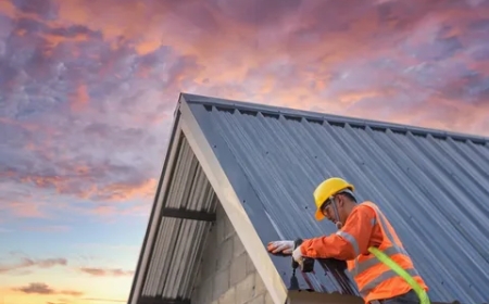
Construction & Property
- Stick with professional and trustworthy tones
- Galactic Cobalt and darker greys convey strength and expertise
- Use clean typefaces with high contrast for clear visibility
Healthcare & Wellness
- Choose colours that promote calm and cleanliness
- Neo-Mint or light blues work well in these sectors
- Focus on creating a reassuring, uncluttered visual environment
Technology & Start-Ups
- Be experimental with colour pairings
- Electric Aqua and Digital Lavender feel fresh and innovative
- Use bold iconography and tech-style typography to support the futuristic look
By understanding what works best for your audience, your hoarding design becomes more effective, not just beautiful.
Mistakes to Avoid When Choosing Colours
Its tempting to jump on the latest trend or pick a colour that simply looks good. But that can lead to expensive mistakes. Here are a few common pitfalls when designing hoardings:
- Using trendy colours that dont match your brand:Consistency always wins
- Poor contrast:If your text isnt readable from a distance, your message is lost
- Ignoring the surroundings:The environment your hoarding is placed in can affect how colours appearconsider lighting, neighbouring buildings, and even the weather
- Choosing low-quality materials:Not all printing methods maintain colour integrity outdoors; poor-quality printing can quickly fade, crack or blur your design
The solution? Plan carefully and use professional materials like dibond to ensure your message stands strong.

Final Design Tips for Eye-Catching Hoardings
Now that youve got your colours and materials lined up, here are a few more tips to get the most out of your hoarding design:
- Keep it simple:A clean, modern design with a single focal point is more impactful
- Use white space wisely:Let your colours breathe
- Avoid clutter:Too much text or imagery dilutes the message
- Test prints:Always review samples before final printing
- Size matters:Make sure text is legible from a suitable viewing distance
When in doubt, less is more. A smart colour palette, powerful visuals, and well-spaced elements will always create a better impression than a busy board with clashing tones.
Conclusion
As we step further into 2025, colour continues to be one of the most important elements in outdoor advertising. Whether you're looking to evoke emotion, build trust, or make a bold brand statement, the right palette can elevate your message in seconds. Pairing those colours with dibond printing ensures your hoarding boards dont just look goodthey last.
By understanding colour psychology, staying in tune with current trends, and avoiding common design mistakes, your hoarding can become a powerful marketing asset. For professionally printed hoardings that capture these trends perfectly, trust the experience and expertise of the Hoarding Print Company.


